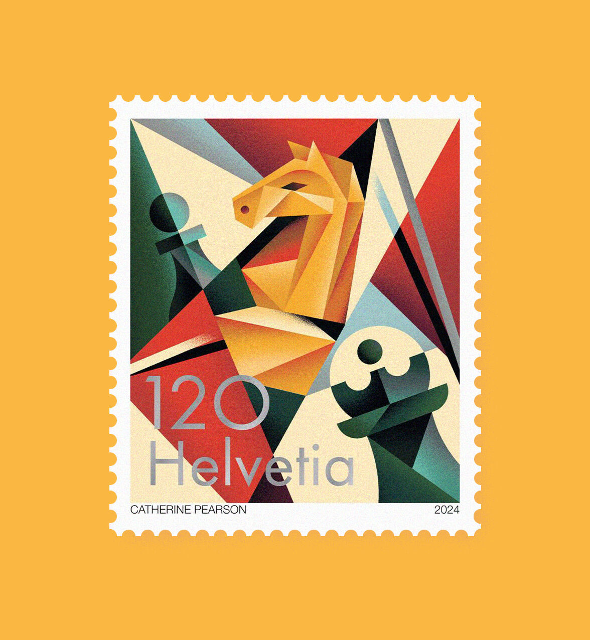
Stamp for Swiss Post

Catherine created a stamp to celebrate the 100th anniversary of the International Chess Federation.
Inspired from the energy and dynamism of the Italian art movement ‘Futurism’, she experimented with bold shapes and intricate composition to embody the calculated tactics used by players to outsmart their opponents

"My concept was to highlight geometric shapes, intersecting and intertwining to symbolize the game’s strategy. I played with rich colors with light and dark tones, to evoke the chessboard and the game’s essence.
Finally, I wanted the chessboard’s pattern weaving through the scene and serving as a unifying element that highlights the connection the game brings to players worldwide"

"On a personal note, what I really loved about this project was that, despite having no skills in playing and little knowledge of chess, I discovered numerous parallels between the game and my work. I thrive on creating intricate designs, meticulously placing every small detail and texture with care and thought, which ultimately isn’t too far from the world of chess"

Catherine Pearson

Swisspost

  • Year

    2024

  • Roles

    Illustrator

Catherine Pearson

Catherine Pearson is a Swiss illustrator. Through her creations, she appropriates a language devoid of words whose colors, textures and geometric shapes are enough to take us where she wants to go. Her illustrations are defined by a decorative and colorful universe, a naivety that gives them a unique style.

Brands

Adobe, Compass Coffee, Cinepolis, Les Échos, HarperCollins, WSJ, Festival Lausanne Lumière, Bô Noël, Intel, Terre des Hommes, Publix, Red Bull, Jones Knowles Ritchie, Domestika, Le Matin Dimanche, La Poste, TheTelegraph, myGwork, Ecole Hôtelière de Lausanne, Grindelwald Tourism,...

collaborate with Catherine Pearson

An idea? A project?
Simply drop us a line to chat about it, and we’ll shape together the right solution for you.

brief his agent